Don’t love your branding? What don’t you love about it? Maybe your logo isn’t representing your vision, the color scheme might be out of date, or the fonts just aren’t right.
Most often branding goes awry when it fails to communicate the true message of the brand. Form follows function in all matters of design, which means if your brand function (messaging) hasn’t been defined, no longer aligns with your business, or isn’t showing up in design choices, then the brand will fall short.
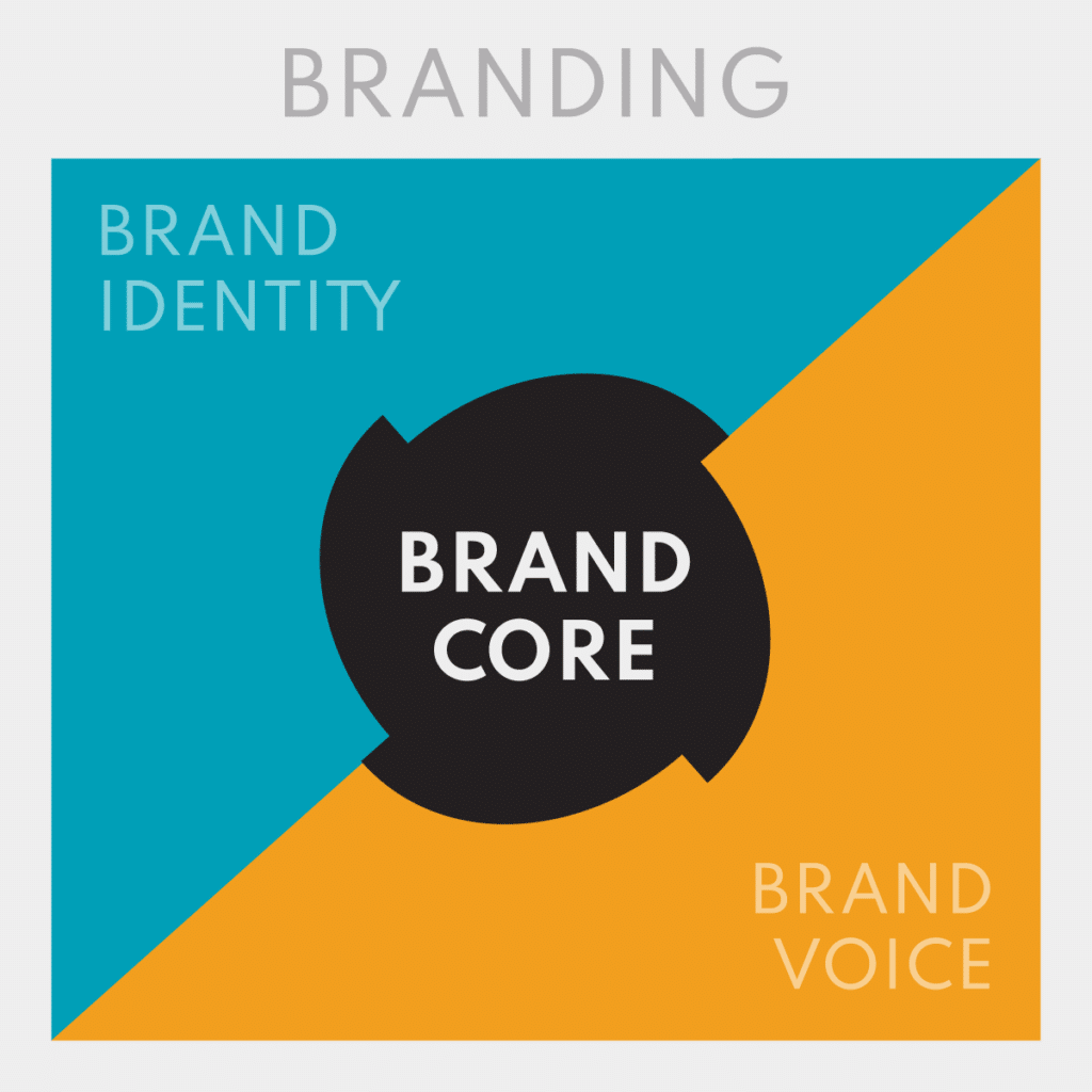
Visual elements (identity) with messaging and tone (voice) strategically coordinated and presented with consistency (system) all make up what is commonly called branding. However, when people “don’t love their branding” they are often referring to the visual elements of their brand, or identity.
Brand identity is built through definition and repetition of visual elements such as fonts, color palettes, symbols, iconography, and layout. Visual revamps are great, but the most breakout branding overhauls address voice and identity together. However, you clicked this blog because you wanted to talk about your identity, so we’ll come back to why the brand voice (messaging and tone/speaking style) is probably more important.
It is always wise to find a design professional that has done similar work to ensure a style match. There is no shortage of freelancers that can bring your vision to life. Today, we are going to go through the various elements that make up a brand identity system so that you understand the decisions that need to be made and are prepared to work in harmony with your new branding bliss.

Logo
Brand identification lives in its symbols, aka the logo. A logo can communicate in 3 different ways: literal, figurative, or abstract. What and how does your logo visually communicate?
If the message is not clear, that can mean it is time to simplify the forms. Ideating the possibilities of symbolism for your brand’s values can help you get out of the box and come up with unique and clever identifiers. All in all, a successful logo communicates one general idea, loud and clearly.
Designing a logo is a whole job on its own; however, deciding the form and requirements to meet brand identity can make the creative flow more accurate. Things that influence decisions about logo form are brand name, brand awareness, industry norms, and shape psychology. Read more about building your brand logo here.
Typography
Let’s review one of the main visual elements of a brand, the typography (brand fonts.) If the text accompanying your brand looks off, the easiest way to discern why is by looking at the font traits and categories of use.
A typographic study can help you find the right font traits for the brand. In a type study, a designer explores and searches for fonts that exhibit traits inline with brand identity and voice. Font pairings include a separate font for headline text and body copy, and evoke different tones depending on the pairing. A comparison of many pairing options will help narrow down the choices. Gain more insight on how fonts convey meaning through form.
A brand can fall short if it does not have enough variation such as using the same font for every category or assigning fonts to a category that aren’t the best fit. Successful brands expand their font palette to include not only headlines and body text; but also display fonts, accent fonts, and more. Defining the scope of the brand font palette is an important step in the study so that visual element decisions will be useful in the setting the brand exists. A content and collateral audit will help decide what font categories the brand should include for consistent use across platforms.
Color
Brand color palette not working for you anymore? Identifying and discussing the negative reaction and what causes it can ideate how the palette should change to speak more towards the brand.
Similar to a type study, a color study can freshen up brand feel and bring more meaningful decisions to color palette use. The big things to consider with success in color use are emotional and psychological responses, industry assignment and norms, and cultural/geographical color meanings.
If the color palette has been defined with meaning but is not being used consistently, the brand will lose coherence. Color assignments and hierarchy can help further visual consistency.
Assigning flagship color(s) can communicate visually what, why, and how your brand is. Color is one of the first things audience members react to, so creating a palette that speaks to your brand pillars can be crucial to establishing the right conversation.
Supporting Graphics
A brand is basic and boring if it lacks supporting visual graphics. This issue shows itself in the form of inconsistent looking branded collateral. You may notice that even though designs include the same brand elements, they are not applied in the same way or rely on different background elements everytime.
Growing your brand to include a pattern or textures gives you a repetitive edge in visual design. It gives design a leg up when it comes to layout, and brings a fuller life to your brand voice. A cohesive design will have background elements that compliment the logo form and build a world for it to live in.
A successful logo has made meaningful choices that speak to the brand. This opens up possibilities to apply these choices to background shape elements, such as patterns or textures, iconography, and layout design. Consistent layout design of visual elements builds visual grammar (Visual grammar refers to a set of rules and practices, which are used to communicate messages through visual design.)
Imagery
Imagery and photography speak to your brand’s real world presence. Stock images are essential for designing branded collateral without having a photo shoot every time you have production needs; however, if not applied strategically can create stale or corporate designs.
Once again, making decisions with visual elements and messaging in mind when it comes to stock imagery can lead to a deeper conversation with your audience. Workshop with the designer to define a photo treatment or image layout that speaks to the brand.
Many things are attributed to how an image communicates: tone or filter of lighting, colors, effects, and composition. Explore how different photo traits affect viewers and find an emotional response that fits your brand. Get more information on photography traits and how they communicate through these 2 articles:
- https://99designs.com/blog/tips/brand-imagery/
- https://goldenvineyardbranding.com/blog/brand-imagery/
Conclusion
Love your brand by giving it the voice it deserves through reviewing and making informed decisions with the visual elements in use. Defining these in a brand guideline, a unified accessible document, allows the brand to be applied in a consistently recognizable way.
A brand guide is the accumulation of all of your branding decisions. It embodies the style to follow to make your brand work. It is a living thing that will grow, so avoid establishing too many rules to follow, and try to use more examples of successful designs. A brand with a successful design system thrives in the real world, is applicable across many platforms and speaks to the targeted audiences.


